I had this project in mind for a while, to illustrate the covers for several of Tamora Pierce's novels. It's something my childhood self would love, so better late than never to do it, right? I started this project last year in late 2016 actually, but got delayed because of work and other commitments. To help me finish the project and get feedback, I enrolled in SmART School, which is an online teaching school by illustrators. I ended up taking Scott Fischer's class after asking Rebecca (the founder of the school) to take a look at my portfolio and which class I should take. I'll talk about the school in a later post, so this one will just focus on the process of creating the final image.
Plot sypnosis: Alanna becomes a knight-in-training in the kingdom of Tortall. The twist is, she has to pretend to be a boy because women aren't allowed to be knights. Alanna also knows the gift, which is like small magicks. She also has a cat bestowed upon her named Faithful, who has purple eyes.
Visual Iconography from book: Alanna's red hair and purple eyes, Her black cat named faithful who also has purple eyes, her Lionness shield with the Lionness Rampant crest
1. Figure out the graphic composition
I had several different options for the cover- I could emphasize her fighting abilities, or the fact that a Goddess character is helping to guide her throughout the story. I decided to go with a strong pose in either C or D. A was too Joan of Arc-y for me, B the silhouette wasn't dynamic enough. In E the silhouette was too dynamic and was too complicated to go with the rampant lion silhouette in the background. I ended up choosing the color variant C because the white lion silhouette and her dark armor contrasted nicely, our eyes just go straight to her face.
Different B&W compositions with Alanna and Faithful
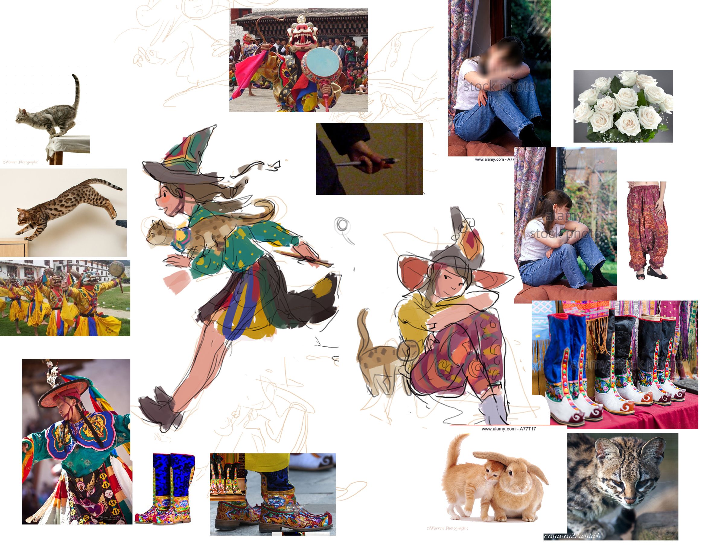
2. Inspiration Board
Inspiration Board for color comps: Jody Lee, Jessica Shirley, Kid Chan/Jody Lee, Kid Chan, Victor Nizovtsev
I usually create an inspiration board for the piece I want to do before actually starting it. It's a combination of existing illustrations and lots and lots of photo references.
3. Color Comps
Color comps for the trio of book covers
I had to think about the colors for the book covers as a set, I wanted each to have a different color theme to differentiate them from each other. Seeing all three together also helped me establish the theme of animal silhouette tapestry behind the heroine of the book. I eventually went with #2 (bottom left).
4. Painting Process
While painting, I like to reference how other artists handle the same subject matter. Here are some of the references I had: medieval armor designs, Krenz Cushart, Otat, Ahmed Aldori, Fire emblem armor designs, more medieval armor.